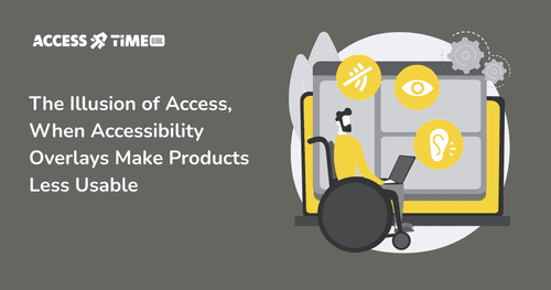
Accessibility Overlays: Why Good Intentions Sometimes Lead to the Wrong Outcome
Prasaja Mukti - Accessibility UX Writer
●●
For many business owners, accessibility starts with a practical question.
"How do we make our product accessible, quickly, without breaking what already works?”
That question is reasonable. Accessibility can feel complex, technical, and risky, especially if your product was not designed with it in mind from day one. This is exactly why accessibility overlays have become so popular.
Overlays promise a simple answer.
-
Add a widget.
-
Enable a few settings.
-
Display an accessibility badge. And suddenly, it feels like you have done the responsible thing.
In most cases, businesses that adopt overlays are not trying to cut corners. They are trying to do the right thing with limited time, limited guidance, and a lot of uncertainty. Unfortunately, this is also where the misunderstanding begins.
What Accessibility Overlays Are Actually Designed to Do
At their best, overlays offer surface-level adjustments. They may help some users increase text size, change contrast, or pause animations. For certain narrow use cases, this can be mildly helpful.
The problem is not that overlays exist. The problem is the expectation placed on them.
Accessibility is often treated as something that can be added on top of an interface, rather than something that must exist within its structure. Overlays reinforce this idea by positioning themselves as a layer that “activates” accessibility after the fact.
For many users with disabilities, especially blind users and keyboard-only users, accessibility does not work that way.
How Blind and Keyboard-Only Users Actually Navigate Products
Blind users do not wait for an interface to offer accessibility. They bring their own tools.
Screen readers like NVDA, JAWS, and VoiceOver are not optional enhancements. They are primary interfaces. Users build years of muscle memory around predictable headings, landmarks, form labels, and keyboard navigation.
When an overlay asks a user to “turn on” accessibility before the product becomes usable, it introduces friction where none should exist. It assumes accessibility starts with the overlay. In reality, accessibility starts with the underlying code and interaction patterns.
Recent academic research reinforces this gap. The Promise and Pitfalls of Web Accessibility Overlays for Blind and Low Vision Users found that overlays frequently fail to deliver meaningful access and can increase confusion for users relying on screen readers and other assistive technologies. Instead of reducing barriers, overlays often add another layer users must work around.
Where Overlays Commonly Break Down
One of the most consistent issues appears in keyboard navigation.
Many overlays inject JavaScript that alters focus behavior, adds hidden elements, or restructures the DOM without full awareness of how the original interface was designed. This can lead to focus traps, broken tab order, non-functional skip links, or conflicts with native browser and screen reader shortcuts.
For a mouse user, this may go unnoticed. For someone navigating entirely by keyboard, it can make a product unusable.
Research and audits by organizations like WebAIM repeatedly show that sites using overlays often have as many or more detectable accessibility issues than sites without them. The presence of an overlay does not correlate with WCAG compliance.
Why Standards Bodies Are Raising Red Flags

Concerns about overlays are no longer limited to advocates and researchers. Industry and disability organizations have also spoken publicly.
The European Disability Forum and the International Association of Accessibility Professionals have both warned that overlays:
-
do not fix underlying accessibility issues
-
can interfere with assistive technologies
-
create a false sense of legal compliance
-
have been associated with continued legal exposure
Regulators are also paying attention. Germany’s rejection of overlays as a valid path to compliance under the European Accessibility Act is a strong signal that “good intent” alone will not be enough. As more countries clarify enforcement, relying on overlays may expose businesses to risk even when their goal was compliance.
The Core Misunderstanding: Accessibility Is Not Personalization
Overlays often frame accessibility as a set of preferences. Bigger text. Higher contrast. Reduced motion.
These can be useful options, but accessibility is fundamentally structural.
-
If form fields lack proper labels, no overlay can reliably fix that.
-
If interactive elements are not built with semantic HTML, scripts cannot make them behave consistently across assistive technologies.
-
If navigation is illogical, no widget can restore predictability.
When overlays fail, users are often blamed. “Did you try turning it on?” becomes an unintended accusation, rather than a solution.
A More Sustainable Way Forward
Accessibility works best when it is quiet.
It is baked into the foundations. Using semantic HTML. Logical focus order. Clear interaction patterns. Real testing with assistive technologies and real users. These decisions reduce rework, legal risk, and long-term maintenance cost.
Overlays may provide limited help in specific situations, but they cannot substitute for accessible design and engineering. Treating them as a shortcut often delays the real work and increases risk later.
If You Are Unsure What to Do Next
If you adopted an overlay because you genuinely did not know where to start, you are not alone. Most businesses are navigating this without clear guidance.
If you are still unsure whether you are doing the right thing, a conversation is often the safest first step.
AccessTime works with organizations not only to audit digital products, but to fix and build accessibility into the product itself, across design, content, and engineering. Accessibility is treated as part of the product architecture.
If you are confused about your current approach or concerned about long-term compliance, you can set up a free consultation to talk through your options and risks before they become urgent.
Real accessibility does not announce itself with a floating button. It works, for the people who need it most, without asking to be turned on.
Contact Us
Ready to explore how accessibility can transform your products? Visit our contact page to learn more about AccessTime consultancy services, or try Access Lens to get started with a fresh perspective on what's possible.
Share:

