Accessibility Features in Figma
Fadhil Abdillah - UI/UX Designer
●●
Figma is currently one of the most popular design tools used by product designers. Its collaborative features are a major reason many designers stay with Figma instead of switching to other design tools.
But did you know that Figma also encourages designers to prioritize accessibility when creating designs?
As one of the world’s leading design tools, Figma does not only focus on the general needs of designers. Beyond that, Figma demonstrates a strong commitment to accessibility in the digital product creation process.
This commitment is reflected in a range of features and support that enable designers not only to create visually appealing designs, but also designs that are accessible and usable by everyone, including people with disabilities.
Figma encourages designers to consider accessibility principles from the very beginning of the design process, ensuring that elements such as color contrast, text size, focus order, and proper tagging are thoughtfully addressed. Through this approach, Figma helps us create inclusive products, making sure that every user, without exception, can interact with our designs comfortably.
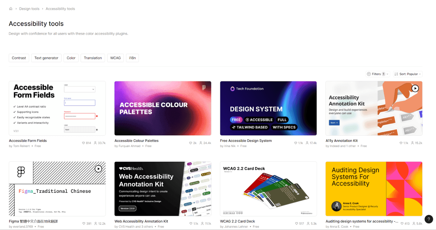
You can see Figma’s commiment to accessibility through the Figma Blog, where accessibility has its own dedicated topic to explore.
Below, I have summarized five of my favorite accessibility features in Figma that I frequently use at AccessTime. I am confident you will find these useful as well.
1. Improved Accessibility Through Figma Annotations
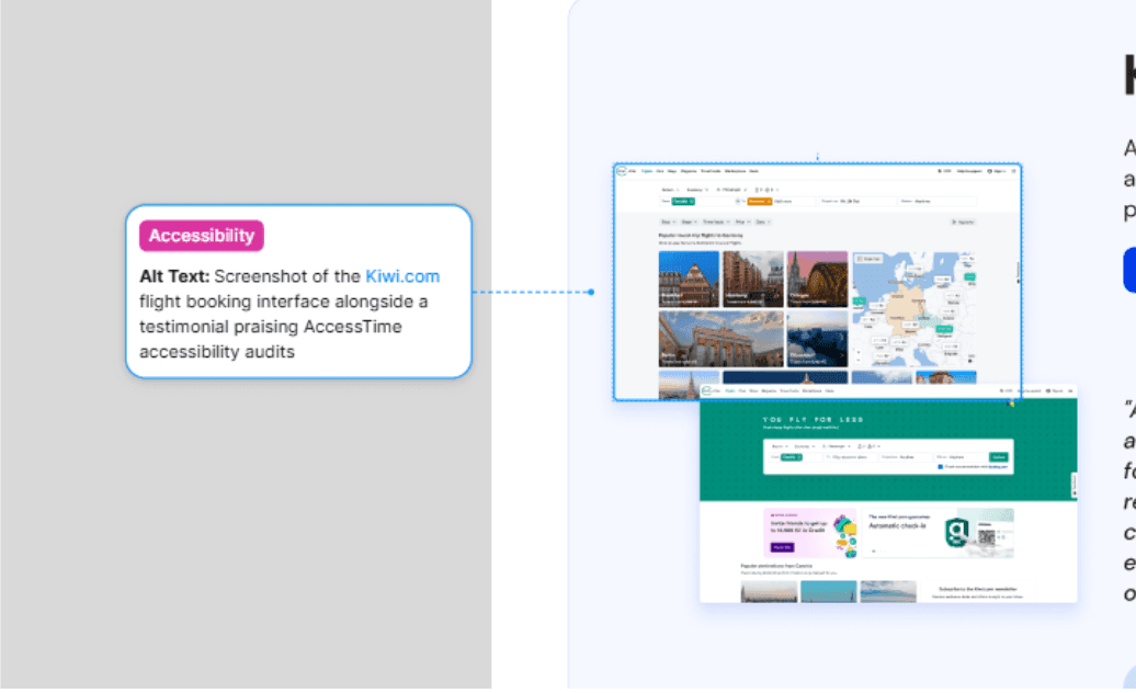
The Annotation feature in Figma now provides a structured way to embed inclusive specifications directly into designs. By using dedicated accessibility categories, designers can document critical non-visual instructions—such as alt text, ARIA labels, and navigation order—that are often missed in purely visual representations.
In Dev Mode, developers can filter these annotations to focus exclusively on accessibility implementation. This ensures WCAG compliance is integrated precisely from design through to code, reducing ambiguity and the risk of misinterpretation.
2. Screen Reader-Friendly Prototypes: Test Inclusivity Early
Figma has expanded its prototyping capabilities to interact directly with industry-standard screen readers such as VoiceOver (macOS), NVDA, and JAWS (Windows).
This feature transforms visual design elements into audio-navigable data structures, delivering several technical benefits:
-
Realistic User Testing Enables usability testing with blind or low-vision users directly at the design stage, without waiting for code implementation.
-
Navigation Structure Verification Ensures focus order and information hierarchy are read logically when navigating with a keyboard.
-
Development Efficiency Supports a shift-left testing approach, validating accessibility early in the product lifecycle to minimize costly fixes later.
With this capability, prototypes are no longer just visual representations, but functional artifacts ready for inclusivity testing.
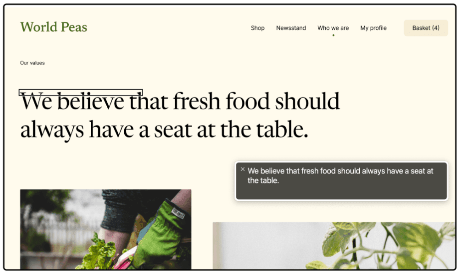
3. No-Code Validation: Testing Accessibility Directly in Figma Using Prototypes
Figma now enables designers to create prototypes compatible with assistive technologies, allowing accessibility validation even before any code is written.
This feature bridges the gap between visual design and non-visual user experiences through the following mechanisms:
Intelligent Conversion: Design to Semantic HTML
When accessibility mode is enabled, Figma automatically translates visual design elements into HTML structures that screen readers can interpret:
-
Interactions Elements with “Navigate to” or “Open link” actions are read as links, while other interactions (such as overlays or smart animations) are read as buttons.
-
Images and Graphics Shapes with image fills are recognized as image elements like
<img>. Alt text is automatically derived from the layer name. -
Document Structure Main frames, components, and instances are translated into labeled sections based on their layer names, providing clear hierarchical context.
-
Text and Lists Regular text is read as content, while bulleted or numbered text is recognized as structured lists.
Logical Navigation Control
Keyboard navigation order (Tab order) is determined by the layer order in the left panel or by Auto Layout direction (top-to-bottom or left-to-right). This gives designers full control to ensure information flow remains logical and coherent.
How to Enable
This mode can be activated via Options > Accessibility settings in Presentation View, or by pressing Tab until the “Skip to content” option appears, then pressing Enter.
With this feature, prototypes evolve from visual simulations into functional tools for accurate inclusivity validation.
4. Frictionless Communication: Voice Chat with Closed Captions
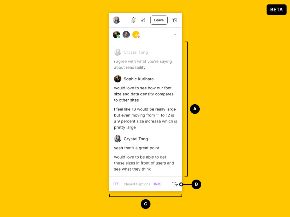
Figma not only helps us design accessible products, but also ensures that team collaboration itself is inclusive, including for team members with hearing impairments.
The voice channel feature allows team members to communicate directly within Figma files or FigJam using audio, similar to in-app voice calls. More importantly, Figma provides real-time closed captions that automatically display live transcripts of voice conversations on screen.
With this feature, Deaf or Hard of Hearing (HoH) designers can fully follow discussions without missing context, reading what is being said in real time.
This demonstrates Figma’s serious commitment to inclusive collaboration. Hearing disabilities are no longer a barrier to effective teamwork within the same design file.
How to Enable:
-
Figma Desktop App: Join an audio conversation, open audio settings, and enable the Closed Captioning toggle.
-
Browser: Enable Live Caption in Chrome to see automatic captions during audio chat.
5. Figma Plugins Supporting Keyboard-Only Navigation
In addition to Figma’s built-in support for mouse-free navigation and screen reader compatibility, several third-party plugins help designers audit and improve accessibility. One recent innovation is plugin parameter support, which allows plugins to run directly from the Quick Actions bar using only the keyboard.
This significantly improves workflows for users with motor impairments or anyone who prefers keyboard-only interaction.
What Are Parameterized Plugins?
Parameterized plugins do not require a UI. They can be fully controlled through the Quick Actions bar (⌘ + / on Mac or Ctrl + / on Windows). You simply type the plugin name, provide the required parameters, and run it—all using the keyboard.
With these plugins:
-
You can run plugins entirely from the keyboard, without using a mouse.
-
Plugins accept input such as text, numbers, or options directly from the Quick Actions bar.
-
Developers can implement autocomplete logic, allowing partial commands to be typed and selected.
This approach greatly benefits users who rely on keyboard navigation and screen readers, as interactions become linear and fully mouse-free.
Recommended Accessibility Plugins
Stark
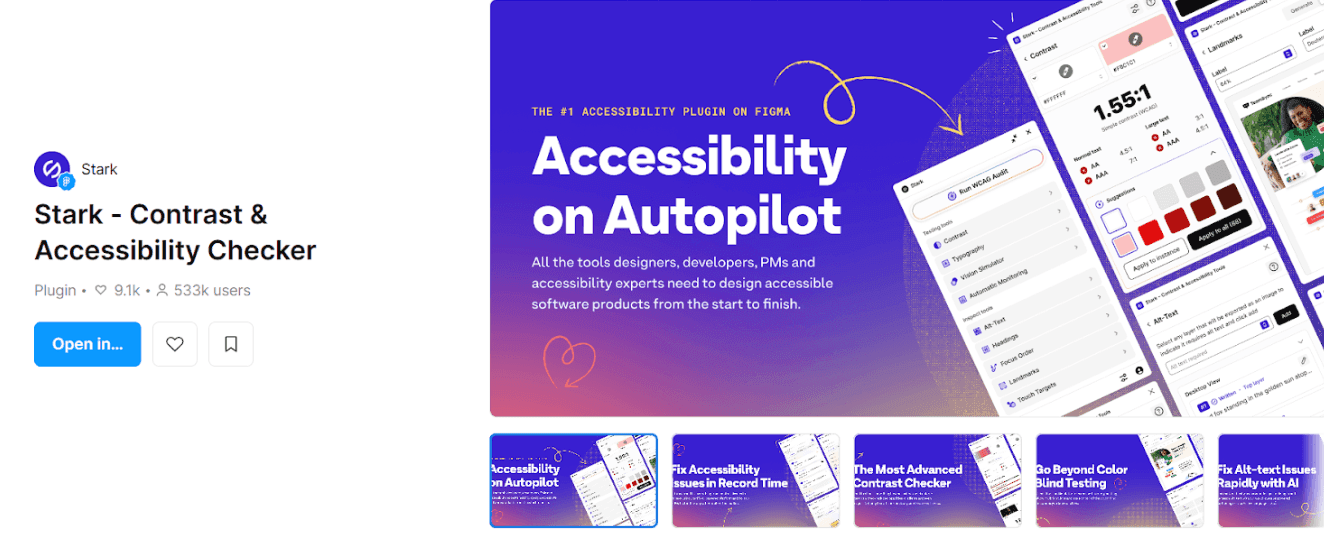
A widely used accessibility plugin offering Focus Order, Contrast Checker, and Vision Simulator features. Stark helps ensure tab order and interactive navigation align with the needs of keyboard and screen reader users.
Focus Order
Helps designers define and visualize the tab order of UI elements—essential for users navigating with keyboards or screen readers.
A11y Focus Orderer
Similar to Focus Order, this plugin focuses on arranging keyboard navigation order and visualizing keyboard flow, which is especially useful during assistive technology testing.
Able & Color Contrast Checker
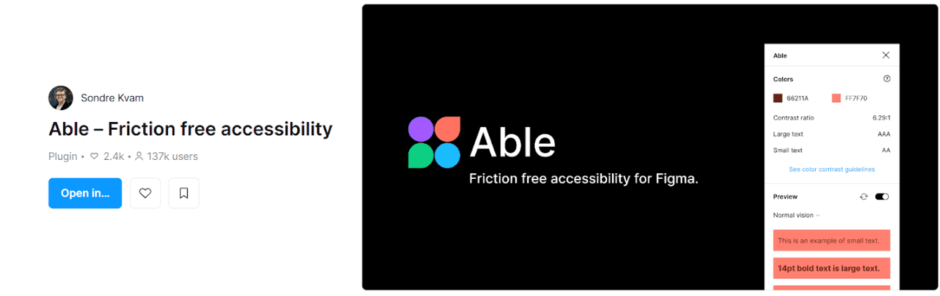
While primarily focused on color and contrast checks, these plugins also support keyboard usability by ensuring key navigable elements remain visually distinct.
Alt Text Generator
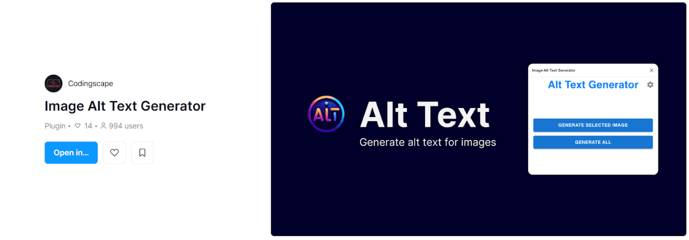
Assists in adding automatic or manual alt text to image elements, which is critical for screen reader users. Proper alt text allows visual content to be accurately conveyed to users who cannot see the screen. All of these features, plugins, and tips are extremely valuable. You can also explore additional accessibility resources directly from the Figma Community.
Figma’s decision to integrate accessibility into the core of the design workflow is a significant and welcome shift. However, tools are only as impactful as how we use them. Whether you are most excited about testing with screen readers or utilizing the new Annotation feature, the next step is the same: integrating these tools into our daily process to ensure better accessibility for everyone.
Contact Us
Ready to explore how accessibility can transform your products? Visit our contact page to learn more about AccessTime consultancy services, or try Access Lens to get started with a fresh perspective on what's possible.
Share:

